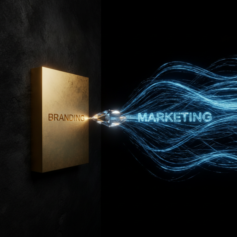

What Is Visual Identity? A Complete Guide to Brand Design
Visual Identity: The Complete Guide to Building a Brand’s Visual System
Stand in front of a shelf packed with near-identical products for a moment. They all promise the same thing, and the prices barely differ. What actually pulls your hand toward one package over another is rarely the product itself — it’s something your eyes register before you read a single word: color, shape, typography, the overall feel. That’s visual identity at work.
Most business owners, when they say “we need a visual identity,” actually mean “we need a nice logo.” But visual identity is much more than a logo — it’s a complete visual system that shapes every interaction a customer has with your brand, from a business card to an Instagram story to a website banner.
What Is Visual Identity and Why Does It Matter?
Visual identity is the set of graphic elements a brand uses to present itself consistently across every touchpoint. This includes the logo, color palette, typography, imagery style, iconography, and even photography direction.
Here’s what often gets missed: visual identity isn’t built randomly — it’s the visual translation of brand strategy. If your brand needs to stand out in a crowded, saturated market, you can’t rely on the same colors and fonts your competitors have used for years. This is exactly where the concept of the Blue Ocean comes in. When your messaging doesn’t differ much from competitors, visual identity can be the fastest signal telling the audience “I’m different.”
Visual Identity vs. Logo vs. Branding
These three concepts get mixed up constantly, though each plays a distinct role.
Logo is simply a mark — a symbol that makes a brand recognizable.
Visual Identity is the larger system that the logo belongs to; it includes color, typography, patterns, and overall visual style.
Branding is the broadest concept, encompassing visual identity, tone of voice, customer experience, and even organizational culture.
Put simply: branding is who your brand is, visual identity is what your brand looks like, and the logo is just one piece of that visual puzzle.
The Core Elements of Visual Identity
1. Logo
The anchor of visual identity, but not the whole of it. A good logo needs to be simple, memorable, and scalable — from a website favicon to a city billboard.
2. Color Palette
Colors communicate emotion before a single word is read. A financial brand typically leans on blue to convey trust, while a brand aiming for bold and energetic often reaches for orange or red. Color choice shouldn’t be a matter of taste — it needs to align with the brand’s personality and target audience behavior.
3. Typography
The fonts chosen for headlines and body text are part of the brand’s personality. A classic serif conveys tradition and credibility, while a clean, modern sans-serif signals freshness and youth.
4. Imagery and Photography Style
The type of photos, icons, and illustrations a brand uses needs to be consistent. A luxury brand typically uses minimal photography with generous negative space, while a family-oriented brand leans into colorful, detail-rich imagery.
5. Patterns and Supporting Graphic Elements
Recurring lines, shapes, or patterns that appear in backgrounds, packaging, or social content, giving the brand a sense of cohesion.
6. Brand Guidelines
A document that codifies the rules for using all these elemen
ts — logo clear space, forbidden color combinations, font sizing. Without this guide, every time a new designer or writer touches the brand, its look and feel can subtly shift.
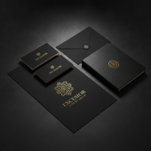
Why Visual Identity Is Critical for Businesses
It controls the first impression. Research shows the brain processes images far faster than text. Before a customer reads a single word of your content, visual identity has already shaped an initial judgment.
It builds trust. A brand with a cohesive, professional look feels more trustworthy by default, even before the product itself has proven anything.
It creates differentiation. In a market where everyone sounds the same, a distinct look can be the first step out of price-based competition and into space competitors haven’t claimed yet — what strategy calls moving from a Red Ocean to a Blue Ocean.
It lowers marketing costs. With a strong, consistent visual identity, audiences recognize your brand faster amid the flood of social content, so you don’t need to reintroduce yourself every single time.

Steps to Building a Strategic Visual Identity
1. Start from brand strategy. Before thinking about colors or fonts, clarify what value the brand delivers, who the target audience is, and what position it wants to own in their mind.
2. Analyze competitors. Study competitors’ visual identities — not to copy them, but to spot the white space. If every competitor uses blue and serif fonts, your opportunity might lie elsewhere.
3. Explore concepts. Build multiple visual directions (moodboards) before settling on a final version, so the choice is deliberate rather than emotional.
4. Test at real touchpoints. A logo looking good on a laptop screen isn’t enough — test it on packaging, the website, social media, even employee uniforms.
5. Document it in brand guidelines. So anyone who later works on the brand’s content knows exactly how to use this identity.

Common Mistakes in Visual Identity Design
- Chasing trends instead of strategy: picking a color or font just because it’s currently popular, without considering fit with brand personality.
- Lack of consistency: using different fonts and colors across Instagram, the website, and packaging, preventing the brand from forming a stable image in the audience’s mind.
- Copying competitors: resembling a successful competitor too closely ties your brand to theirs in the customer’s mind instead of building distinction.
- Frequent, unjustified rebrands: changing identity often without strategic analysis erodes the trust built over time.
Final Thoughts
Visual identity is far more than a nice logo or a pleasant color scheme — it’s the silent language your brand speaks every day, in every post, every package, every customer interaction. If that language isn’t built on solid strategy, even the most beautiful design won’t create real differentiation in the audience’s mind. That’s exactly the work we do at Rahkar: building visual identity from brand strategy outward, not separately from it — so your brand builds its own Blue Ocean instead of competing in a crowded Red one.
References
- Wheeler, A. Designing Brand Identity: An Essential Guide for the Whole Branding Team. Wiley.
- Aaker, D. A. Building Strong Brands. Free Press.
- Kapferer, J. N. The New Strategic Brand Management: Advanced Insights and Strategic Thinking. Kogan Page.
- Neumeier, M. The Brand Gap: How to Bridge the Distance Between Business Strategy and Design. New Riders.
- Kim, W. C., & Mauborgne, R. Blue Ocean Strategy: How to Create Uncontested Market Space and Make the Competition Irrelevant. Harvard Business Review Press.